Synchronization of Epidemic Curves of COVID-19 among Nearby Countries
Epidemic curve is plot of number of patients (P), number of deaths (D) and D/P in the vertical axis along time in the horizontal axis. Though variable from one country to another, epidemic curves of nearby countries were similar and synchronized. Synchronization was brought about not by transboundary movement but by synchronized evolution of the epidemic in respective countries.
Introduction
Susceptibility to SARS-CoV-2 infection was influenced by genetic factors, such as, Neanderthal trait [1], alpha-1 antitrypsin (AAT) deficiency, and other traits [2, 3, 4, 5]. The number of patients or deaths per population was ~10-fold higher for countries in American and European regions than for countries in other regions, which was attributable to high prevalence of alpha-1 antitrypsin (AAT) deficiency among Caucasian [6, 7]. Case-fatality rate was, however, ~0.01 across regions [8]. Number of patients or deaths due to SARS-CoV-2 infection was correlated with the population size within a region but not across regions [8]. As the regionality could have been brought about by different progression of the epidemic among regions, the number of patients (P), that of deaths (D), and that of patients divided by that of deaths (D/P) were followed region by region.
Data Source
Morbidity and mortality data were derived from Coronavirus disease (COVID-19) Weekly Epidemiological Update (https://www.who.int/emergencies/diseases/novel- coronavirus-2019/situation-reports).
Epidemic Curves of COVID-19 in Different Regions
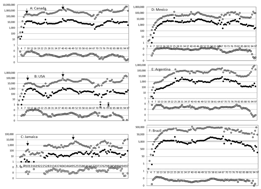
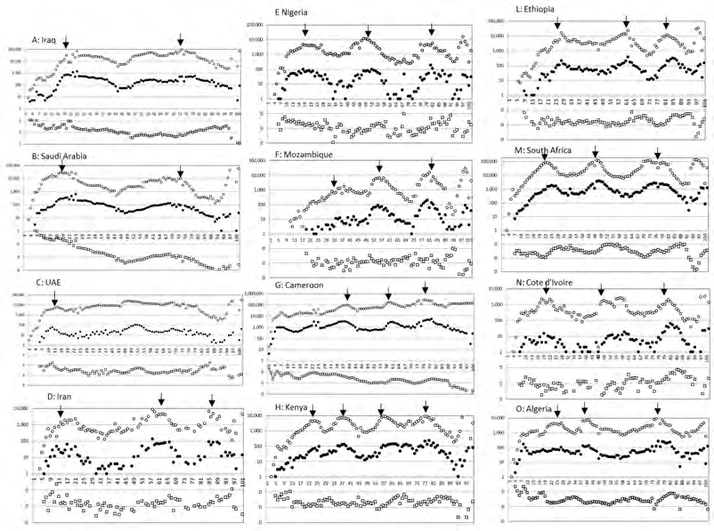
Epidemic curve is plot of number of patients (P), number of deaths (D) and number of deaths divided by number of patients (D/P) in the vertical axis along time in the horizontal axis. Figs 1-4 show epidemic curves of COVID-19 for countries in different regions starting from the fourth week of January 2020 till the fourth week of January 2022. Peaks of waves are indicated by downward arrows. It was found:
- In Asia (Figure 1), epidemic curve was similar for China, Republic of Korea and Japan (panels A-C), for Vietnam, Cambodia and Thailand (panels D-F), and for Australia and New Zealand (panels G-H). Philippines’ epidemic curve (panel I) resembled Bangladesh’s (plots not shown).
- In Western Europe (Figure 2), epidemic curves of Germany, Italy, France, United Kingdom, Denmark and Norway Figure 2 (panels A-F) were similar with an initial large wave followed by smaller waves. In Eastern Europe, epidemic curves were rather flat for Belarus and Russian Federation (panels H-I), while for Ukraine (panel G) it was initially flat but became wavy like in Western Europe.
- In North America (Figure 3, panels A -C), epidemic curves of United States of America (USA) and Canada were similar with a large initial wave followed by small waves; similar trend was observed for Jamaica (panel C) and Haiti (plots not shown). In Latin America (panels D-F), such as, for Mexico, Brazil and Argentina, the epidemic curve was rather flat.
- In Middle East (Figure 4, panels A-C), epidemic curves of Iraq, Saudi Arabia and United Arab Emirates (UAE) were similar. In Africa (Figure 4, panels E-Q), epidemic curves of Nigeria, Mozambique, Cameroon, Kenya, Ethiopia, South Africa, Cote d’Ivoire and Algeria were similar. Epidemic curve of Iran (panel D) resembled those of Nigeria, Mozambique and Ethiopia (panels E, F and L).
The above analysis showed that epidemic curves were similar among nearby countries within regions but not across regions. It explains why the number of the patients or the deaths due to SARS-CoV-2 infection was not correlated with the population size across regions [8].
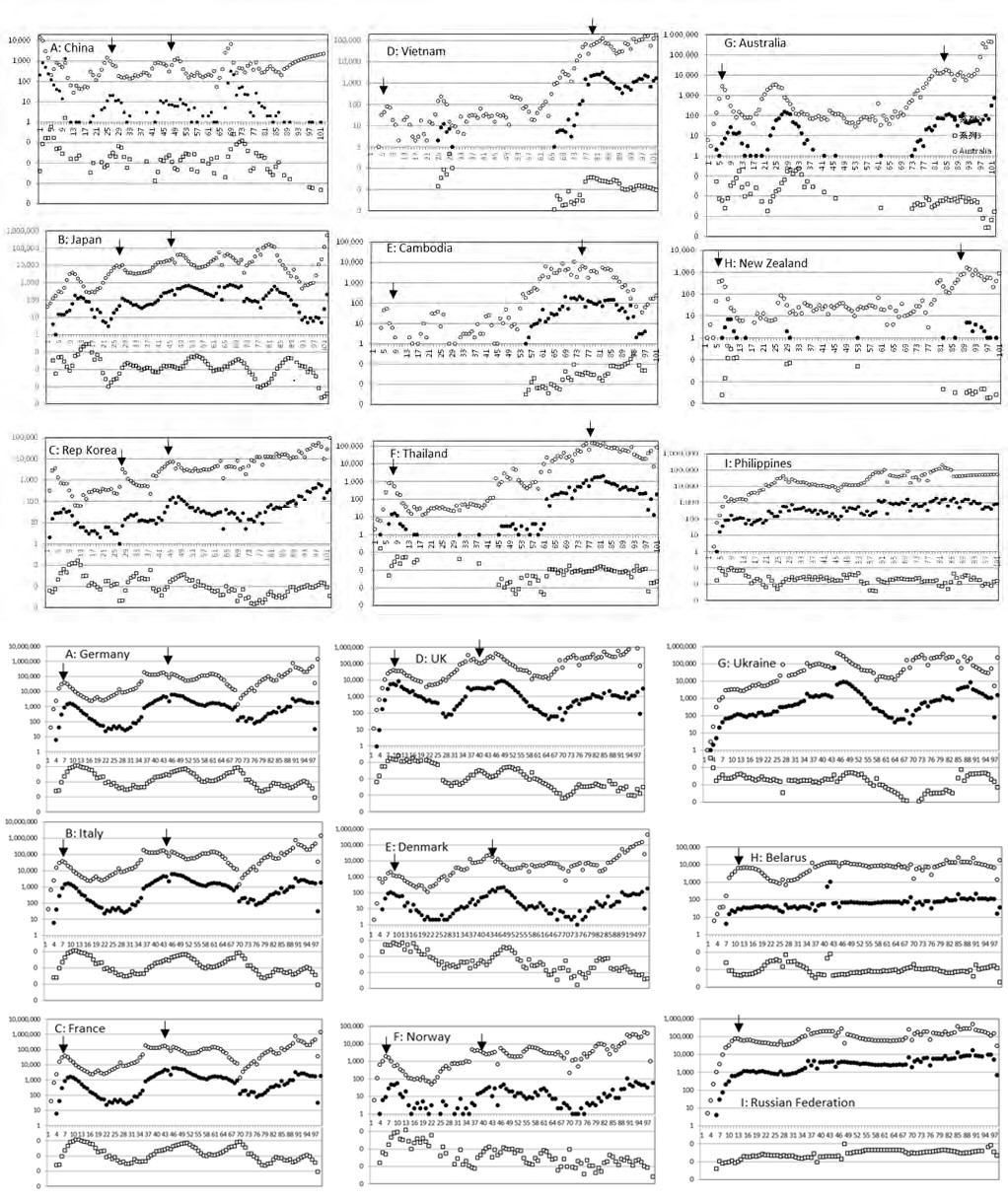
Figures 1-4: Epidemic curves of SARS-CoV-2 for Asian countries. Horizontal axis: weeks starting from 21 January 2020. Vertical axis: logarithm of the number of the patients P (○), that of the deaths D (●) and that of D/P (□). Peaks of waves of the patients are marked by downward arrows.
Shape of Epidemic Curves
Epidemic curves undulated with succession of ⋂-shaped waves, which are represented by an equation y=kN2x(1-x), where y is new infection, x fraction of population already infected, 1-x fraction of the population yet to be infected, N population size and k constant [9]. This model predicts: where population is small and crowded or when virus spreads quickly, epidemic curve becomes narrow; where population is large or sparse or when virus spreads slowly, the epidemic curve becomes broad. Actually, in crowded Western European countries, epidemic curves were narrow and high (Figure 2 A-F), while in less crowded Eastern European countries epidemic curve was flat and wide (Figure 2 G-I).
In China, Japan and Rep Korea (panels A-C in Figure 1), Germany, Italy and other Western European countries (panels A-F in Figure 2), USA and Canada in North America (panels A-B in Figure 3), D/P became lower wave by wave suggesting emergence of attenuated variants.
Why are Epidemics of nearby Countries Synchronized?
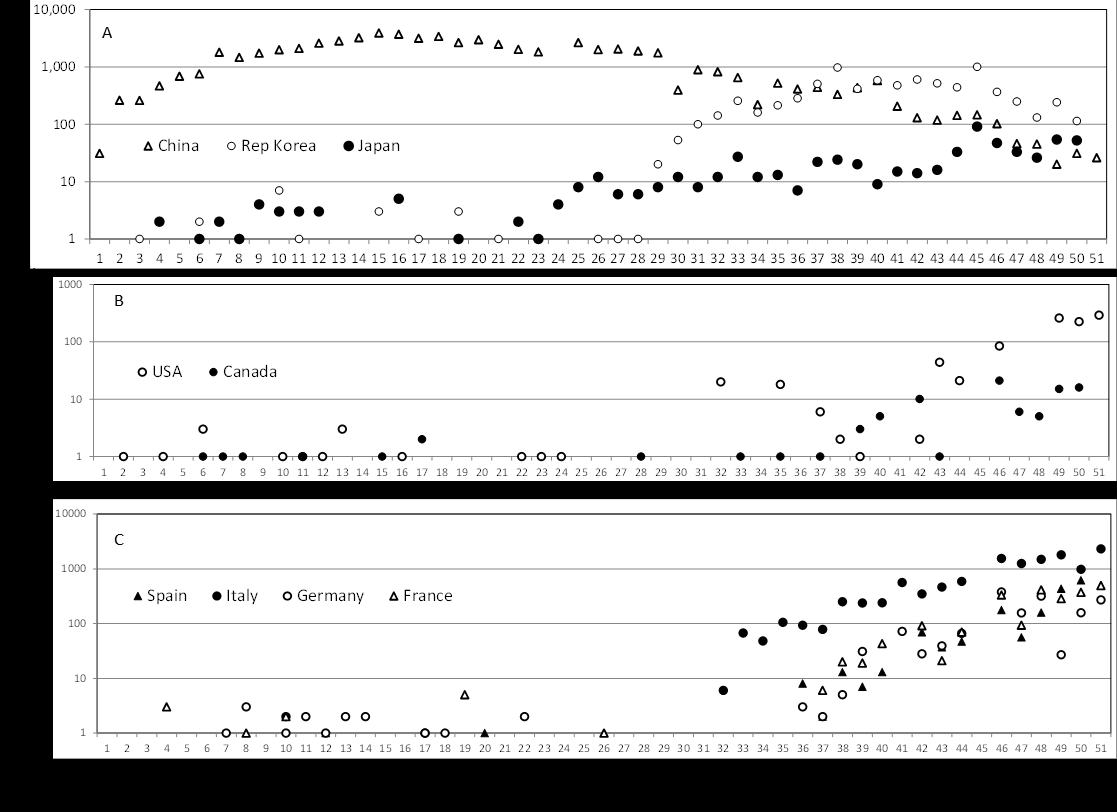
Synchronization of the epidemics can be brought about by frequent cross-border importation exportation. To examine this possibility, the early phase of the epidemic was followed starting from 21 January 2020. As shown in Figure 5, SARS-CoV-2 cases were sporadic for ~30 days for Republic of Korea and Japan (panel A), and for ~40 days for USA, Canada (panel B), Spain, Italy, Germany and France (panel C). After this incubation period, number of the patients increased continuously. As the sporadic cases reported during the incubation period were related to importation, it was suggested that importation played little role in synchronization of the epidemics. How could epidemics in two nearby countries be synchronized? Here, it is important to note that SARS-CoV-2 consists of quasi- species, e.g., median 38 minority variants per sample [10]. In an epidemic wave, dominant variant(s) will be eliminated by host immune response leaving minor variants. From the minor variants, a mutant that becomes dominant in the next epidemic wave will emerge. Actually start of a new wave coincided with emergence of new clades of SARS-CoV-2 (GISAID-NextStrain provided by GISAID-Initiative). Thus, the present epidemic wave is influenced by the previous epidemic and the next wave by the present epidemic. It is reminiscent of Kuramoto model, a mathematical model used to describe synchronization [11]. In two nearby countries where epidemic started simultaneously, similar quasi- species should have initiated the epidemic, and as the two countries shared similar ethnic, geo-demographic, and other conditions, impact of the receiving environment on the epidemic should have been similar. Such situation must have resulted in synchronization of the epidemic among nearby countries.
Conflict of Interest
None to declare
Acknowledgements
The author’s thanks are due to AIDS Research Center, National Institute of Infectious Diseases, for providing him with the research space.
References
-
Zeberg H, Pääbo S (2020) The major genetic risk factor for severe COVID-19 is inherited from Neanderthals. Nature 587: 610-612.
-
Vianello A, Braccioni F (2020) Geographical overlap between aplpha-1 antitrypsin deficiency and COVID-19 infection in Italy: causal or casual?. Arch Bromcjoneumol 56(9): 609-610.
-
Shapira G, Shomron N, Gurwitz D (2020) Ethnic differences in alpha‐1 antitrypsin deficiency allele frequencies may partially explain national differences in COVID‐19 fatality rates. Faseb J 34(11): 14160-14165.
-
Yoshikura H (2021) Epidemiological correlation between COVID-19 epidemic and prevalence of α-1 antitrypsin deficiency in the world. Glob Health Med 3(2): 73-81.
-
Yamamoto N, Yamamoto R, Ariumi Y, Mizokami M, Shimotohno K, et al. (2021) Does Genetic Predisposition Contribute to the Exacerbation of COVID-19 Symptoms in Individuals with Comorbidities and Explain the Huge Mortality Disparity between the East and the West?. Int J Mol Sci 22(9): 5000.
-
de Serres FJ, Blanco I (2012) Prevalence of α1-antitrypsin deficiency alleles PI*S and PI*Z worldwide and effective screening for 12each of the five phenotype classes PI*MS, PI*MZ, PI*SS, PI*SZ, and PI*ZZ: a comprehensive review. Ther Adv Respir Dis 6(5): 277-295.
-
Blanco I, Bueno P, Diego I, Holanda SP, Lara B, et al. (2017) Alpha-1 antitrypsin Pi*SZ genotype: estimated prevalence and number of SZ subjects worldwide. Int J Chron Obstruct Pulmon Dis 12: 1683-1694.
-
Yoshikura H (2021) Regionality of SARS-CoV-2 epidemic under the influence of prevalence of alpha-1 antitrypsin deficiency: similar case-fatality rate in all the regions but about 10-fold higher number of patients or deaths per population in American and European regions. London Journal of Medical and Health Research 21(3): 1-6.
-
Yoshikura H (2021) Epidemic curves of COVID-19 unaffected by vaccination. Epidemiol Int J 5(4): 000209.
-
Jary A, Leducq V, Maler I, Marot S, Frutos EK, et al. (2020) Evolution of viral quasi-species during SARS-CoV-2 infection. Clin Microbiol Infect 26(11): 1560-1560.
-
Strogatz S (2003) Sync: the Emerging Science of Spontaneous Order. In: 1st (Edn.), Hyperion New York.
- Epidemiological Surveillance and Rumors on Social Media
- Awareness and Treatment of Uncontrolled Hypertension in US Overweight/Obese Youths Aged 16–24 Years, NHANES 2021–2023
- Strengthening EPI Through Parental Engagement: Lessons from Dhaka Slums for IA-2030
- Mothers Knowledge of the Prevalence, Causes, Effects, Prevention and Control of Diarrhoea among Children in Ife East Local Government Area, Ile Ife, Osun State, Nigeria
- Covid-19 Reinfections Case Series from October 2023 to October 2024 in A General Medicine Office in Toledo (Spain)
- Water Contact! One Risk Too Many: Risk Factors Associated with Schistosoma haematobium infection in Osun State, Nigeria