Synchronization of COVID-19 Epidemic among Different Prefectures and Different Age Groups in Japan
Epidemic curve is plot of the number of the patients (P), the number of the deaths (D) and the number of the deaths divided by the number of the deaths (D/P) in the vertical axis against time in the horizontal axis. From January 2020 to April 2022, there were six waves in Japan, which were synchronized among prefectures as well as among age groups. D/P decreased wave by wave suggesting emergence of attenuated variants wave by wave. A model based on the quasi-species theory explaining the synchronization phenomenon is proposed.
Introduction
COVID-19 epidemic in Japan progressed uninterruptedly despite of nationwide vaccination [1]. Budich J, et al. [2] suggested that mitigation strategy of COVID-19 epidemic based on selective protection of vulnerable individuals could not contain the epidemic because of synchronization of the epidemic [2]. As the COVID-19 epidemic was synchronized among nearby countries [3], I suspected if the failure of containing epidemic of COVID-19 in Japan was brought about by the synchronization effect. To test this possibility, I examined to which extent COVID-19 epidemic was synchronized in Japan.
Data Source
• NHK: Coronavirus special site https://www3.nhk.or.jp/ news/special/coronavirus/data-widget/ for Figure 1.
• Ministry of Health and Welfare Japan: Visualizing the data: information on COVID-19 infections https:// covid19.mhlw.go.jp/en/ for Figure 2 and Table 1.
• Statistics Bureau, Ministry of Internal Affairs and Communications: https://www.stat.go.jp/data/ jinsui/2021np/index.html) for age distribution of Japanese population in Table 1.
| 50s | 7,991 | 3,18,513 | 808 | 0.2537 | 0.0399 | 0.01011 |
|---|---|---|---|---|---|---|
| 60s | 8,185 | 1,71,987 | 1,550 | 0.9012 | 0.0210 | 0.01890 |
| 70s | 6,782 | 1,23,103 | 4,142 | 3.3647 | 0.0182 | 0.06107 |
| 80s | 3,153 | 70,135 | 6,093 | 8.6875 | 0.0222 | 0.19320 |
| 90< | 432 | 18,618 | 2,441 | 13.1110 | 0.0431 | 0.56510 |
| Females | ||||||
| Age | Population (Pop)* | Patients (P) | Deaths (D) | D/P (%) | P/Pop (%) | D/Pop (%) |
| <10 | 5,327 | 3,81,784 | 1 | 0.0003 | 0.0717 | 0.00002 |
| 10s | 5,539 | 3,74,312 | 2 | 0.0005 | 0.0676 | 0.00004 |
| 20s | 6,128 | 5,51,188 | 8 | 0.0015 | 0.0899 | 0.00013 |
| 30s | 7,201 | 4,76,309 | 29 | 0.0061 | 0.0661 | 0.00040 |
| 40s | 9,263 | 4,64,793 | 74 | 0.0159 | 0.0501 | 0.00080 |
| 50s | 7,974 | 3,01,238 | 199 | 0.0661 | 0.0378 | 0.00250 |
| 60s | 8,642 | 1,61,249 | 469 | 0.2909 | 0.0186 | 0.00540 |
| 70s | 8,097 | 1,21,109 | 1,723 | 1.4227 | 0.1500 | 0.02179 |
| 80s | 5,194 | 1,01,967 | 4,583 | 4.4946 | 0.0196 | 0.08824 |
| 90< | 1,390 | 55,278 | 3,944 | 7.1348 | 0.0398 | 0.28370 |
Table 1: • Statistics Bureau, Ministry of Internal Affairs and Communications: https://www.stat.go.jp/data/ jinsui/2021np/index.h
* x1,000 Table 1: Age distribution of male and female population (x1000) (Pop) in Japan in 2021, and age distribution of the total number of the patients (P), that of the deaths (D), case-fatality rate (P/D), the total number of patients per 1000 population (P/Pop) and the total number of the deaths per 1000 population (D/Pop) as of April 2021.
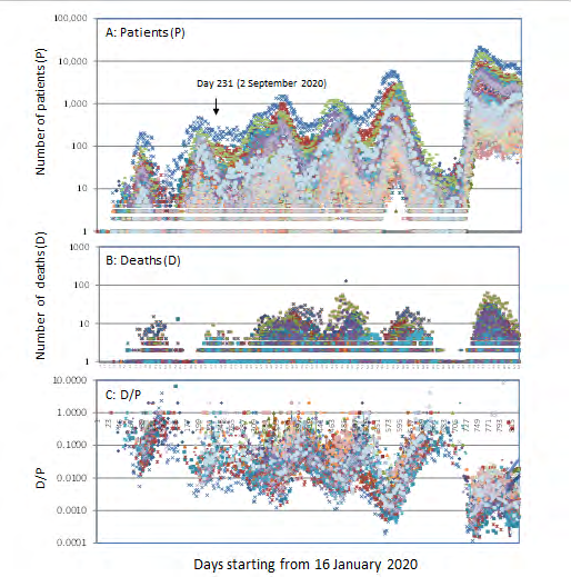
Figure 1: Epidemic curves of COVID-19 epidemic among 47 prefectures in Japan. Daily number of the patients (P) (panel A), that of the deaths (D) (panel B) and that of D/P (panel C) are plotted in the vertical axis against time starting from 16 January 2020 to 25 April 2021 in the horizontal axis. The downward arrow in panel A indicates the date when data for males and females (Figure 2) became available.
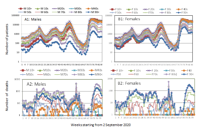
Figure 2: Epidemic curves of COVID-19 epidemic among different age groups in Japan. Weekly number of the patients (panel A1 for males and panel B1 for females) and that of the deaths (panel A2 for males and panel B2 for females) are plotted in the vertical axis against time starting from week 2~9 September 2020 to week 13~19 April 2022 in the horizontal axis.
Epidemic Curves for 47 Prefectures in Japan
Epidemic curve is plot of daily number of the patients (P), daily number of the deaths (D), and daily number of the deaths divided by daily number of the patients (D/P) in the vertical axis against time in the horizontal axis. Fig. 1 shows epidemic curves of 47 prefectures in Japan from 16 January 2020 to 25 April 2022. There were six waves that were synchronized. As the epidemic progressed, waves of the patients became higher (panel A), while waves of the deaths (panel B) remained in the same level. Consequently, D/P declined wave by wave (panel C) indicating emergence of less and less virulent variants. As shown above, epidemic waves of COVID-19 of different prefectures were overlapping and were perfectly synchronized. Similar plots using the data provided by WHO (https:// covid19.who.int/table) revealed synchronization among Bosnia Herzegovina, Bulgaria, Croatia, North Macedonia, Republic of Moldova, Romania, and Serbia in Europe (plots not shown). Thus, the synchronization of the epidemic curves was not limited to epidemics within a country.
Epidemic Curves for Different Age Groups among Males and Females
Data for males and females are available starting from September in 2020. As shown in Fig. 2, epidemic curves for male patients (panel A1) and those for female patients (panel B1) were synchronized among age groups. For the age group 90<, the plot level was lower for males than for females. Epidemic curves for the deaths resembled that of the patients but were less synchronized due to time lag between infection and death which is variable depending upon underlying health conditions.
Age distribution of the patients or the deaths can be influenced by age distribution of the total population. As shown in Table 1, while peak age of general population (Pop) was 40s for males and females, population aged 90< was larger for females than for males (2nd column), which explains why the plot level of the patients in age group 90< was lower for males than for females in Fig. 2. Though peak age of the patients (P) was 20s (3rd column) and that of the deaths (D) was 80s (4th column) both for males and females, case fatality rate (D/P (%)) (5th column) was two-fold higher for males. Though age distribution of the patients per population (P/Pop (%)) was similar for males and females (6th column), number of the deaths per population (D/Pop (%)) was two-fold higher for males (7th column).
Discussion and Conclusion
It has been generally believed that, in an epidemic, a variant emerges in one place and then spreads to other places. If so, there should have been time lag between one epidemic wave in one place and corresponding epidemic wave in another place, and the time lag is expectedly variable from one place to another. As shown above, however, epidemic waves of COVID-19 were overlapping and were perfectly synchronized geographically. It was as if emergence of new variants in different places was preprogrammed. How can it be possible?. Based on the observation that SARS-CoV-2 epidemic progressed as quasi-species accompanying 38 minority variants per sample [4] and based also on previous work on evolution of quasi-species of other viruses [5, 6, 7], a model of COVID-19 epidemic was constructed as illustrated in Figure 3.
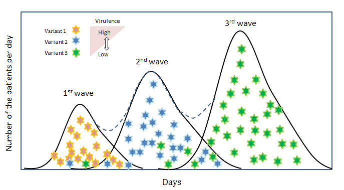
The epidemic consists of succession of overlapping epidemic waves.
- In the later phase of the 1st wave, variant 1 is eliminated by the host immune response and replaced by a minor variant 2.
- Variant 2 are less virulent and spread faster than variant 1 on account of higher mobility of the patients.
- Variant 2 is replaced by variant 3, which is more attenuated and spreads more rapidly. Wave by wave, circulating virus becomes more and more attenuated.
- In an ethnically homogeneous country like Japan, variants escaping from the host immunity will be similar in different places, and such situation will lead to synchronization of the epidemic in the country.
Though the model is deterministic, it has been pointed out that “quasispecies theory was formulated initially as a deterministic theory” [6].
References
-
Yoshikura H (2021) Epidemic Curves of COVID-19 Unaffected by Vaccination. Epidemol Int J 5(4): 000209.
-
Budich J, Bergholtz EJ (2021) Synchronization in Epidemic Growth and the Impossibility of Selective Containment. Math Med Biol 38(4): 467-473.
-
Yoshikura, H (2022) Synchronization of Epidemic Curves of COVID-19 among Nearby Countries. Epidemol Int J 6(1): 000227.
-
Jary A, Leducq V, Maler I, Marot S, Frutos EK, et al. (2020) Evolution of Viral Quasi-species during SARS-CoV-2 Infection. Clin Microbiol Infect 26(11): 1560.e1-1560.e4.
-
Martin V, Domingo E (2008) Influence of the Mutant Spectrum in Viral Evolution: Focused Selection of Antigenic Variants in a Reconstructed Viral Quasispecies. Mol Biol Evol 25(8): 1544-1554.
-
Domingo E, Sheldon J, Perales C. (2012) Viral Quasispecies Evolution. Microbiol Mol Biol Rev 76(2): 159-216.
-
Andino R, Domingo E (2015) Viral Quasispecies. Virology 479-480: 46-51.
- Epidemiological Surveillance and Rumors on Social Media
- Awareness and Treatment of Uncontrolled Hypertension in US Overweight/Obese Youths Aged 16–24 Years, NHANES 2021–2023
- Strengthening EPI Through Parental Engagement: Lessons from Dhaka Slums for IA-2030
- Mothers Knowledge of the Prevalence, Causes, Effects, Prevention and Control of Diarrhoea among Children in Ife East Local Government Area, Ile Ife, Osun State, Nigeria
- Covid-19 Reinfections Case Series from October 2023 to October 2024 in A General Medicine Office in Toledo (Spain)
- Water Contact! One Risk Too Many: Risk Factors Associated with Schistosoma haematobium infection in Osun State, Nigeria