Icon Interpretation and Understanding: A Cross-Cultural Case Study of Product Interface
Electronics and appliances are often designed and manufactured from all around the world, and imported to India. Hence, they are not designed considering the Indian mental model in mind. In a country where there are 22 official languages and a countless number of dialects and cultures, it is necessary to communicate through a visual language rather than words or written language. Icons and visuals on appliances become essential for comprehending the functionality of an appliance. This paper interprets a case study on one such home appliance which is widely used by Indians; it investigates the usability of icons and product interface present on washing machines. The paper also highlights cross-cultural icon design implications and understanding mental models of the users. The study has been carried out in 3 phases – questionnaire, comprehension test and ranking test. The data collected from the 3 phases have been analyzed to determine the impact on Indian audience.
Introduction
An icon can be defined as a graphical representation of concepts that represents particular actions. Professionals of icons design argue that icons of the interfaces enjoy many advantages [1, 2, 3]. One such advantage being ease of using the product and recognizing the functions. It is also suggested that graphic images help users memorize and recognize functions available within an application. The attribute of pattern recognition in the human brain helps us comprehend images faster than text. In addition, icons used on interfaces are especially important for novice users who use interactive systems infrequently. To be effective, an icon must fulfill several criteria, such as whether it is visible, legible, and comprehensible. Icons are designed and interpreted differently in different regions of the world. As a result of a cross-cultural study on icon comprehension among different users in different countries [4], it was observed that the perception of icons varied from Europe, to Asia, to the Scandinavian countries, thus establishing the fact that icons need to be designed for a particular context; else the usability and functional ability of the device can decline. It is a challenge for designers to design icons which can be used across different cultures and countries. A well-designed and tested icon can not only improve the usability of the device but also the product can be used by the global market rather than its regional market [5].
Marcus recommended that good icon design should be simple and clear. Studies have found that the visual and cognitive features of icons significantly influence an icon's effectiveness. People today come across various brands of washing machines like Samsung, Philips, whirlpool etc. Each brand has a variety of models and each model has different user interface ranging from knob and button to touch interface and different set of icons representing particular functions. Ideally, the icons used in interface design should be in a such a way that most of the users can understand it without referring to a user manual. It is important to understand the mental model of the users with respect to regional ethnicity comprehending all basic information in the most simple way [6, 7, 8].
Unfortunately, some of these icons are short of ideal. Washing machines of different types, have some frequently used common functions such as power on/off, rinse, drain, water level, and they are represented differently across each brand around the world. For our research, we analyzed icons of 8 functions in the washing machine, i.e., Water Level, Drain Water, Air dry, Wash Drum, Rinse, Spin, Delay and Quick Wash by conducting a survey consisting of comprehension and ranking test which helped us understand the users' mental model, what kind of icons they understand, and how they relate to each function.
**Gap Analysis**
The literature review indicates that a significant amount of research has been done on the usability aspects of icons in isolation and on products. Some cross-cultural studies on icons have also been performed. However, usability of icons used on products and how that usability aspects changes when the product crosses one geographic boundary has not been done in much detail. In the Indian context, such studies are missing. India has a large population, and is a huge market place for companies. Hence, this paper studies several washing machine icon interfaces with respect to an Indian audience. Each brand offers different icons and user interface and even worse the same brand offers different icons and UI's for its devices. These icons are inconsistent, and difficult to comprehend or understand without using a user manual. Prior to the survey, 15 washing machines were observed, the sample set comprised of washing machines across different brands as well as different models in the same brand. The common functions among all the washing machines were taken forward for the study and inconsistencies in representation of their icons were noted. This gave an understanding of how current washing machine brands depict/visualize their functions in the form of icons.
**Methodology**
**Participants Selection**
In an attempt to understand the functions used on a washing machine, a survey was conducted among a group of approximately 30 people. People from different parts of Bangalore city, took the survey. The survey was conducted keeping two main focus groups in mind - bachelors who live by themselves, and women who handle household chores of their entire family such as laundry. At a high level, the assumption made was that majority of the users who use washing machines fall into these two groups.
**Experimental Set Up**
The survey was totally divided into three parts – questionnaire, comprehension test and ranking test. The first part of the survey comprised a structured questionnaire with few open-ended questions. It included questions related to most frequently used functions on the washing machine, as well as price-range. This questionnaire helped in identifying the commonly used icons on a washing machine interface, thus forming the basis for the second and third part of the survey. The following questions were asked as a part of the survey:
- Which company does your washing machine belong to? (users were asked to mention model no. and price, if possible).
- Why did you choose the specific brand? What aspect made you buy the product?
- How many times do you use the washing machine in a week?
- What functions do you use the most?
- Do different fabrics need a different setting? If yes, how do you wash clothes of various fabrics?
- When you first bought the washing machine, how did you figure out the functions?
The second part comprised of an icon comprehension test as shown in Figure 1: Comprehension Test. The icons of common features, on a washing machine, were shown individually to each user (Air Dry, Drain Water, Water Level, and Drum Clean). The users were asked to identify the icons shown. This helped in understanding how users interpret existing icons.
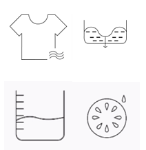
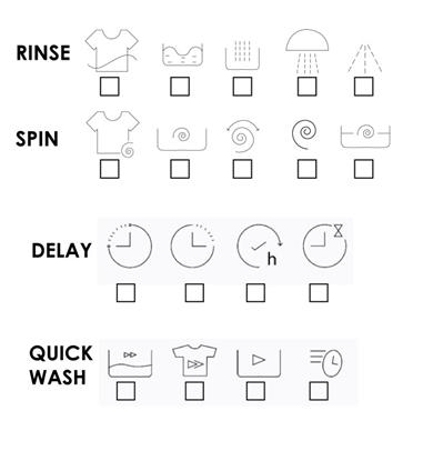
Figure 1: Comprehension test. The third part comprised of a ranking test shown in Figure 2: Ranking Test. Existing icons for the same function, across numerous washing machines and brands, were shown to the user. Based on their comprehension of each icon, they were asked to rank the below icon sets from 1 to 5; 1 being the best and 5 being the worst. Based on their comprehension of each icon, they were asked to rank the below icon sets from 1 to 4; 1 being the best and 4 being the worst.
The main aim of the survey was to understand how users comprehend current icons and functions on washing machines. The results of this survey were used as inputs for the comprehension test and mean ranking.
Results and Discussion
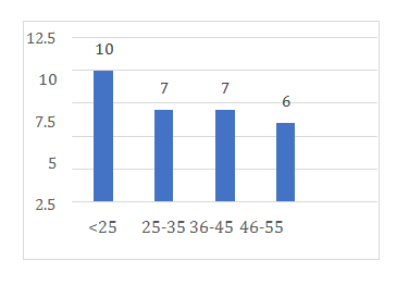
Physical Characteristics of Participants
The 30 participants consisted of mothers and
bachelors. The break-up of the sample set in terms of age
and gender has been shown in figure 3. 57% of the users
were females and 43% were males.
• Sample Set Age
$$ \text {M e a n}: \mu = \left(\Sigma X _ {i}\right) / N $$
= 33.55 years Standard Deviation: ( ) = – 2 / N i X σ μ Σ =
11.76years. Range: 19-52 years
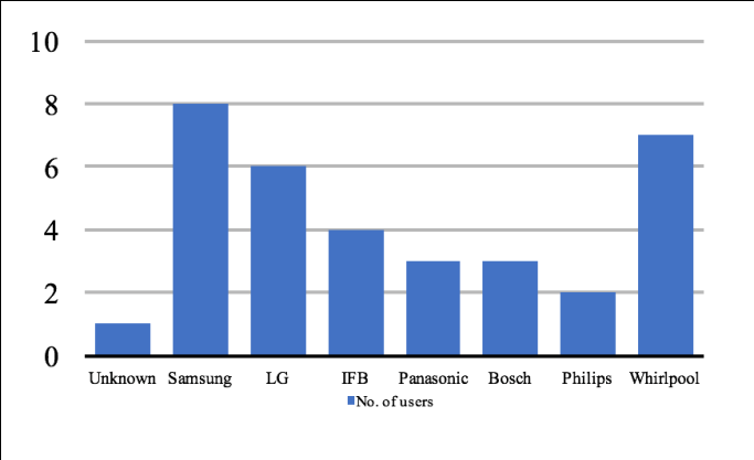
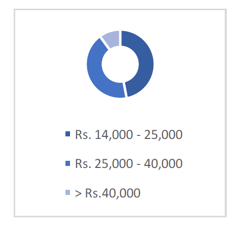
• Price Range (as shown in figure 5)
• How They Learnt the Functions (as shown in figure 8)
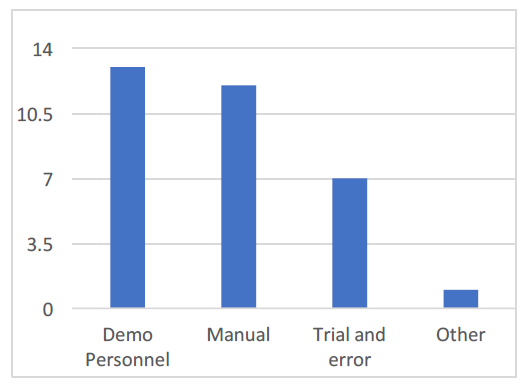
Figure 8: How they learnt the functions.
- Comprehension Test Four icons were tested in the comprehension / stereotype test. While few icons were immediately identified, there were some icons the users struggle to comprehend. They associated with a shirt icon and were able to guess the functionality. However, functions like drum clean were associated with a lemon, since, the Indian audience is more familiar with a lemon than the inside of a washing machine drum. Hence, such observations were noted to understand the icons in the Indian context.
- Air Dry Icon 21% of the users were able to guess the icon correctly while 72% failed to recognize it. They identified with the shirt but could not associate the 3 waves with the function. Wash or rinse was a common misunderstanding amongst a few users.
- Drain Water 27% of the users were able to guess the icon correctly while 73% failed to recognize it. The users associated the icons with a decreasing water level.
- Water Level 58% of the users were able to guess the icon correctly while 42% failed to recognize it. This function is a very commonly used icon, and quite consistent across the washing machine, hence, most of the people were able to recognize it, or were close to the function it intended to showcase.
- Drum Clean 6% of the users were able to guess the icon correctly while 94% failed to recognize it. This icon was present on high-end machines hence; there was barely any familiarity to the icon across the sample set. The users associated this icon with a half-cut lemon or an orange and were confused as to how this can be associated with a washing machine. From the above comprehension test, it is inferred that user’s recognized icons which they could associate with a real-life object they are familiar with. For example, the shirt, associated with washing in this context, was recognized by most. However, the drum clean icon which represented the inside drum of the washing machine was misunderstood to a lemon, since they were more familiar with a lemon on a daily- basis instead of a washing machine drum.
Ranking Test
A ranking test was administered to the users for four sets of icons. Their opinions and ranks were then analyzed, where 1 was considered the best and 5 the worst. As mentioned earlier, the icon with a shirt was the most understood and was ranked 1st. After the users’ rankings were obtained, the mean ranking of each icon was calculated. The icon with the least value of mean ranking has been ranked the best and the icon with the highest value of meaning ranking has been ranked the worst in terms of interpretation. The results of the ranking test have been determined as shown in Figure 9 Mean Ranking.
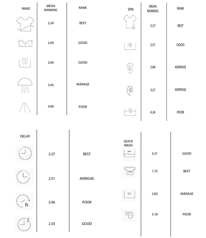
Similar to the comprehension test, from the ranking test, it can be concluded that icons with shirts were ranked the best since the users could associate the function more easily. Icons with a bucket or a tub were ranked average. Icons with more than 3 elements had poor comprehension and were ranked the worst.
Conclusion and Design Direction
From the comprehension and ranking tests, few conclusions have been made. Firstly, icons regardless of cultural and regional background need to be minimal (least number of elements). This reduces the cognitive load on the user. Secondly, icons have different interpretation across different countries and cultures. The Indian mental model is different from the countries where washing machines are designed and manufactured. Hence, the visuals which fit in their mental model, regional ethnicity, geographical boundary is not the same as that of the Indian audience. Low level of comprehension is also due to the inconsistencies across brands and within the brand. However, India is a large market for the brands and hence, the Indian perspective cannot be overlooked during the design process. Given that India is a multi-cultural country, design development in the country needs to be done on an extensive scale. Indians associate the icons with their daily chores and objects that are present around them. Therefore, icons with shirts are the most comprehended and ranked the best while a washing machine drum is not comprehended at all. Icons must be redesigned in such a way that they are associated with an Indian aspect, which will make the users recognize the icons easily. Icon design isn’t about visual appeal. The usability and recognition of the icons must be given emphasis rather than aesthetics. It is inappropriate to assume that if an icon works well in one region of the world, it would be equally effective elsewhere. One needs to test out the mental models of the users of the region and ethnicity to design icons. Rigorous and continuous testing must be conducted to validate and iterate the icons and visuals.
Future Work
The research currently comprises of a small sample set of 30 people of Bangalore. To further validate the study, a larger sample set is required which is spread across cities, towns, social status, age groups and geographical regions. Furthermore, icons should be redesigned to be understood by the audience and applied by brands.
Consistency is an important factor which brands should maintain both within their company as well as across brands.
Acknowledgement
Acknowledgement is owed to all the interviewees who have volunteered to take part in our survey.
References
-
Weidenbeck S (1999) The use of icons and labels in an end user application program: an empirical study of learning and retention. Behavior & amp Information Technology 18(2): 68-82
-
Kacmar CJ, Carey JM (1991) Assessing the usability of icons in user interface 1991. Behavior and Information Technology 10(6): 443-457.
-
Lodding K (1983) Iconic interfacing. IEEE Computer Graphics and Applications 3(2): 11-20.
-
Piamonte DPT, Abeysekera JDA, Ohlsson K (2001) Understanding small graphical symbols: A cross- cultural study. International Journal of Industrial Ergonomics 27(6): 399-304.
-
Maguire MC (1985) A review of human factors guidelines and techniques for the design of graphical human-computer interfaces. Computer Graphics 9(3): 221-235.
-
Wickens CD, Hollands JD (1999) Engineering psychology and human performance. Prentice Hall, New York.
-
Luo Shijian, Zhu Shangshang (2010) User experience and product innovation design. China Machine Press, Beijing.
-
Heim S (2007) The resonant interlace; HCI foundations for interaction design. Addison Wesley, New York.
- The Expanding Landscape of Road Rage: A Systematic Review of Conflicts Involving Drivers, Pedestrians, and Micromobility
- Validating Cognitive Models of Royal Navy Performance on Control Systems
- Comparing Standard and State-of-the-art Firefighter Coats on Postural Balance and Gait in a Live Burn Environment
- Investigating the Integration of Telemedicine into Clinicians Workflow: A Review of Methods
- Risk Assessment of Ergonomic Factors in a Textile Firm by RULA, REBA and Fine Kinney Methods
- Impact of Self-Esteem Training on Individuals with Disabilities Aged 17-30